AUDITORIUM TRANSPARENCY
Design: OMO
Contact: i@omo.london
Location: Kiev, Ukraine
Area: 800 m²
Contact: i@omo.london
Location: Kiev, Ukraine
Area: 800 m²
Authors: Natalia Shchyra, Jo Farish
Contributors & Collaborators: Interior Mebel, StandPoint, Sirius 93, Prostir 86, Design Tour, Pavel Trush, Dmitro Chemriz, Ksenia Sobol, Yulia Boiko
Contributors & Collaborators: Interior Mebel, StandPoint, Sirius 93, Prostir 86, Design Tour, Pavel Trush, Dmitro Chemriz, Ksenia Sobol, Yulia Boiko
Photographer: Ivan Avdeenko
How to see the invisible?
How to show something that is not material?
How to create a collaborative atmosphere?
How to show something that is not material?
How to create a collaborative atmosphere?
Presenting openness, honesty and sharing as a substance was our key target for this project.
Our teams solution: see through structures organised around people’s transit scenarios.
Concentrating the attention on the non-material idea the main tools were textile and a play of light:
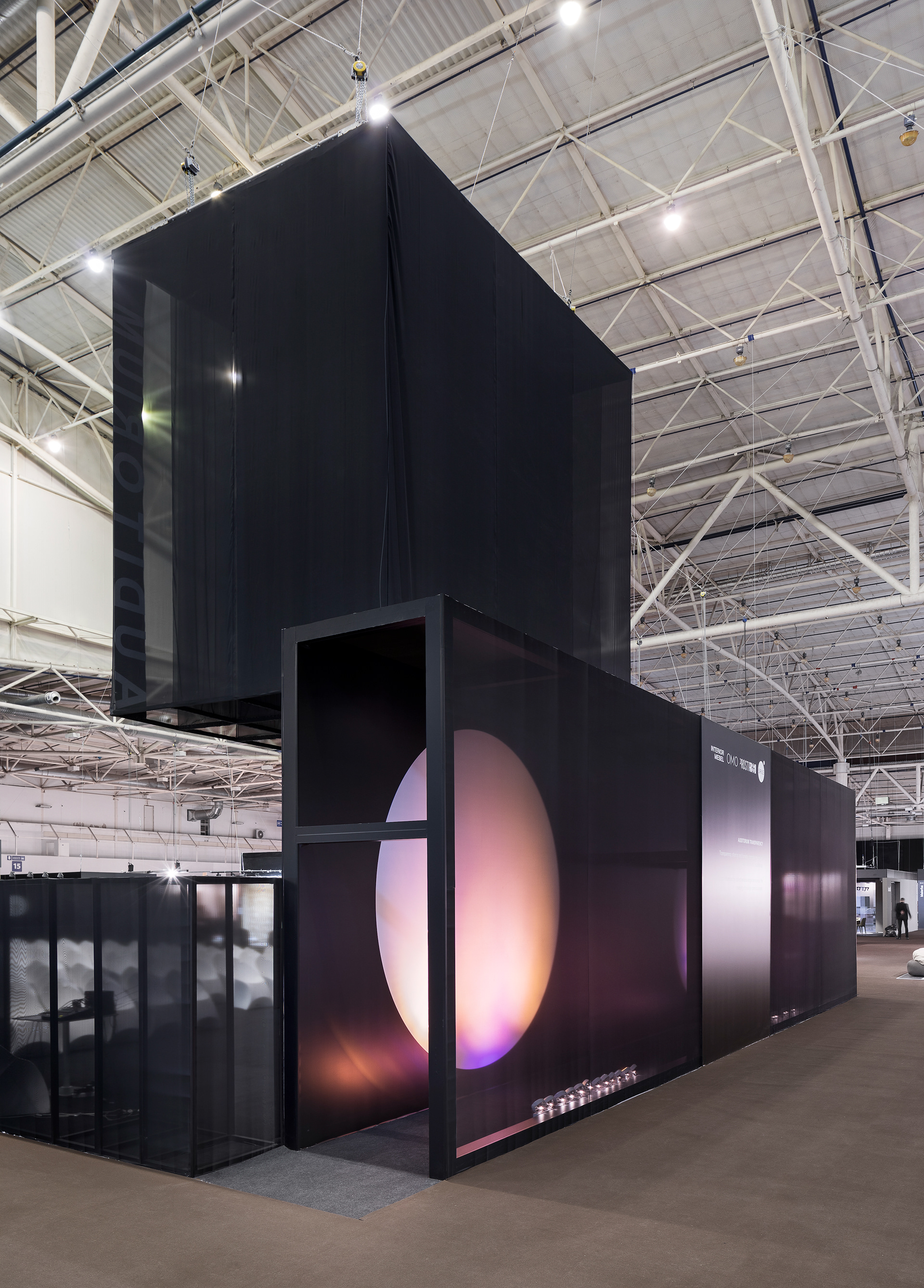
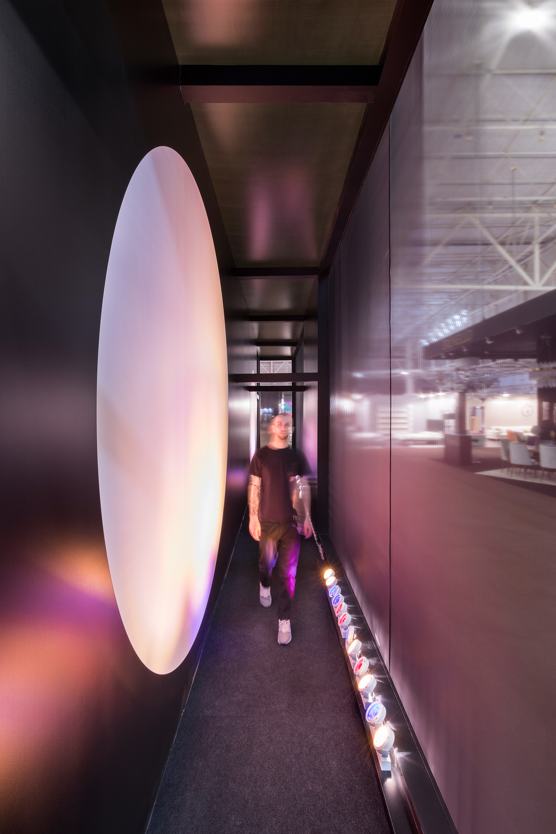
Minimalistic aesthetics of the monochrome transparent cotton layers were balanced with the coloured shadow theatre inside of the backstage tunnel.
The weightless rectangle composed out of the fabric layers soared under the dome of the exhibition pavilion.
Using a specific structure order allowed us to play with the visibility - both connecting and dividing the spaces.
Our main pride is the transformation of a functional space into interactive experience, creating social interaction, inspiring the audiences to explore, contemplate and create.
The approach:
Focusing primarily on the “social collaboration” allowed us to change the project meaning - it become a heart of the exhibition rather than only the “auditorium function” and could be used by every visitor rather than just the industry professionals and “the people who knows where to search for the information” only.
On the process level we believed that the idea required sharing and more open collaboration - involved clients in the process, sharing - debating - updating at each stage.
Our approach was 100% trust and belief that every team member does his best. We involved many outsiders to comment on the project during the design stage, analysed and implemented the community feedback. Every person related contributed to the project through the prism of their experience and knowledge.
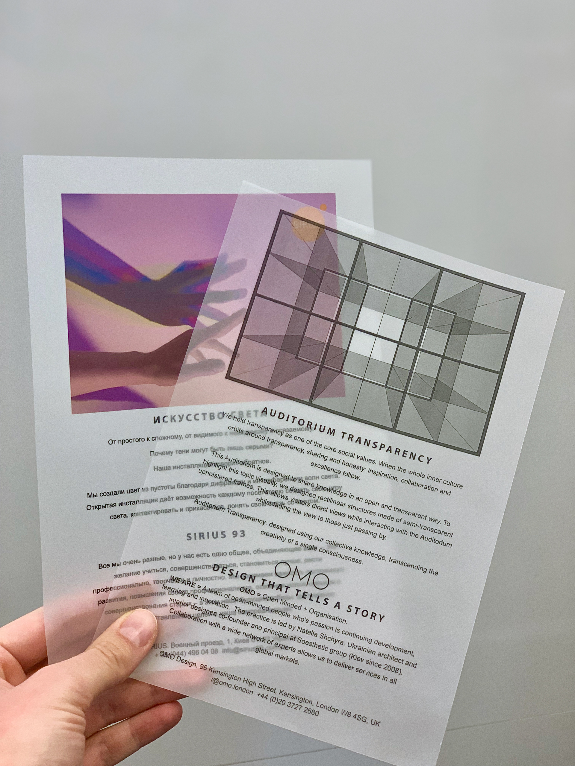
We hold transparency as one of the core social values. When the whole inner culture orbits around transparency, sharing and honesty: inspiration, collaboration and excellence follow.
This Auditorium is designed to share knowledge in an open and transparent way.
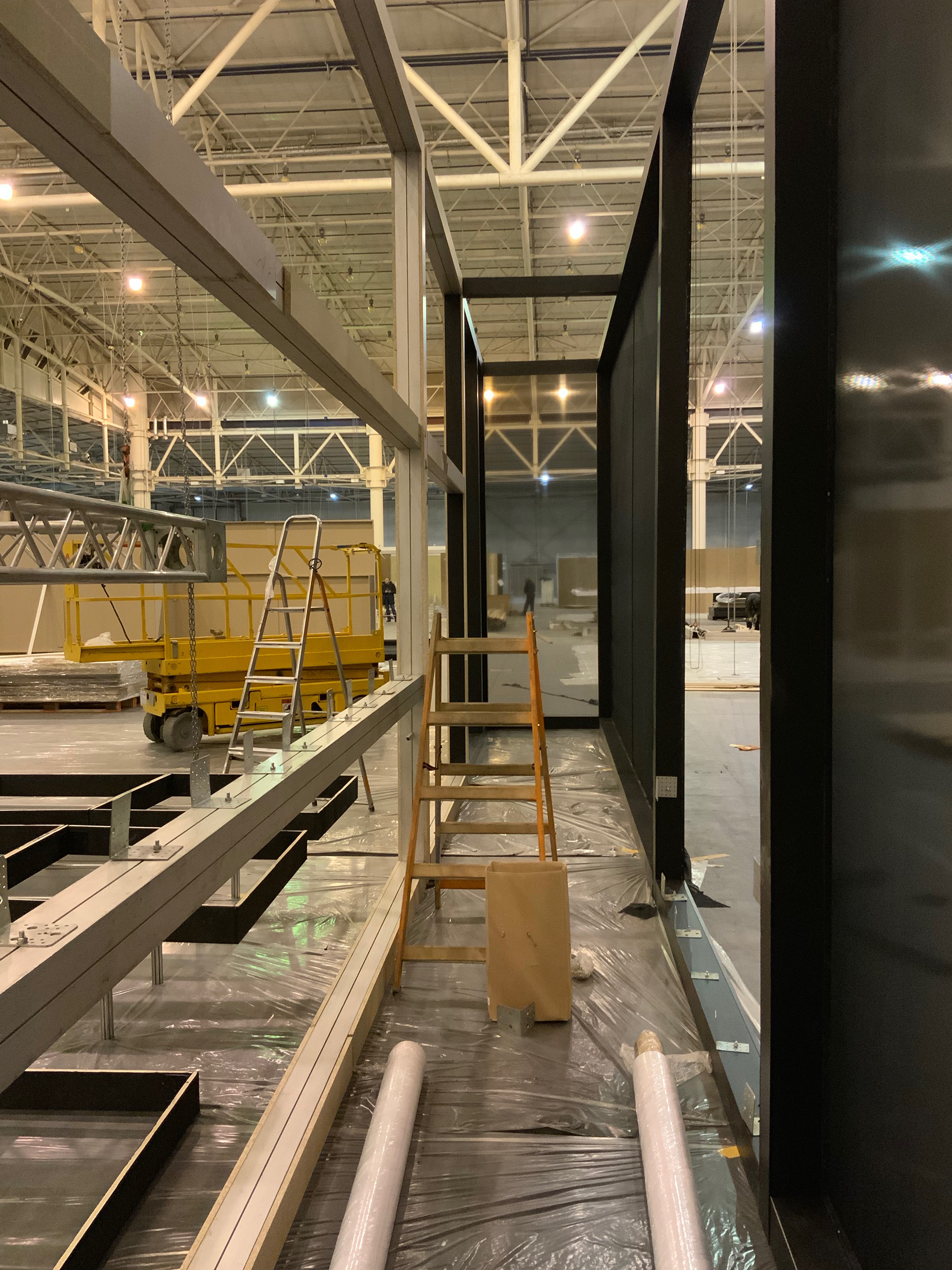
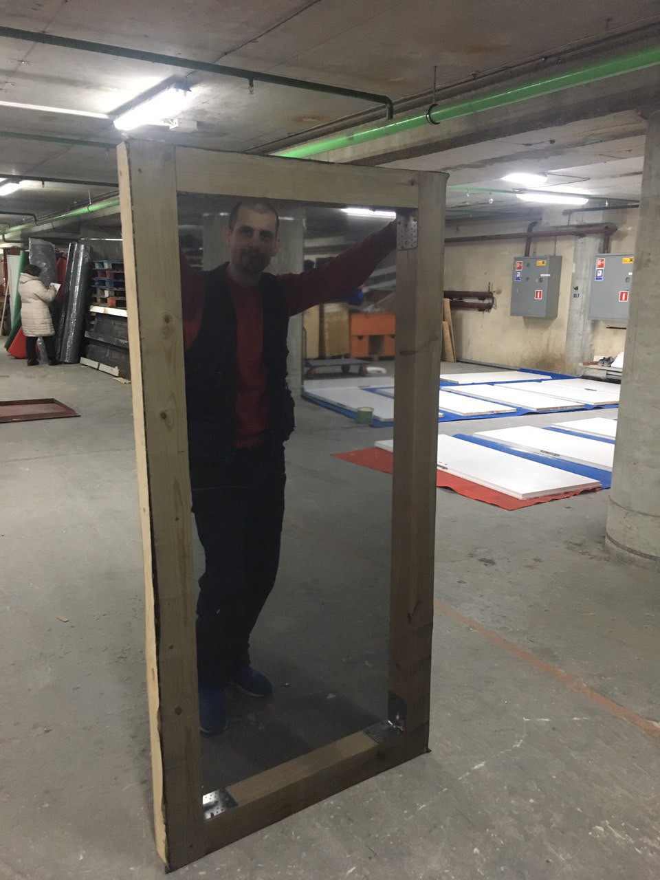
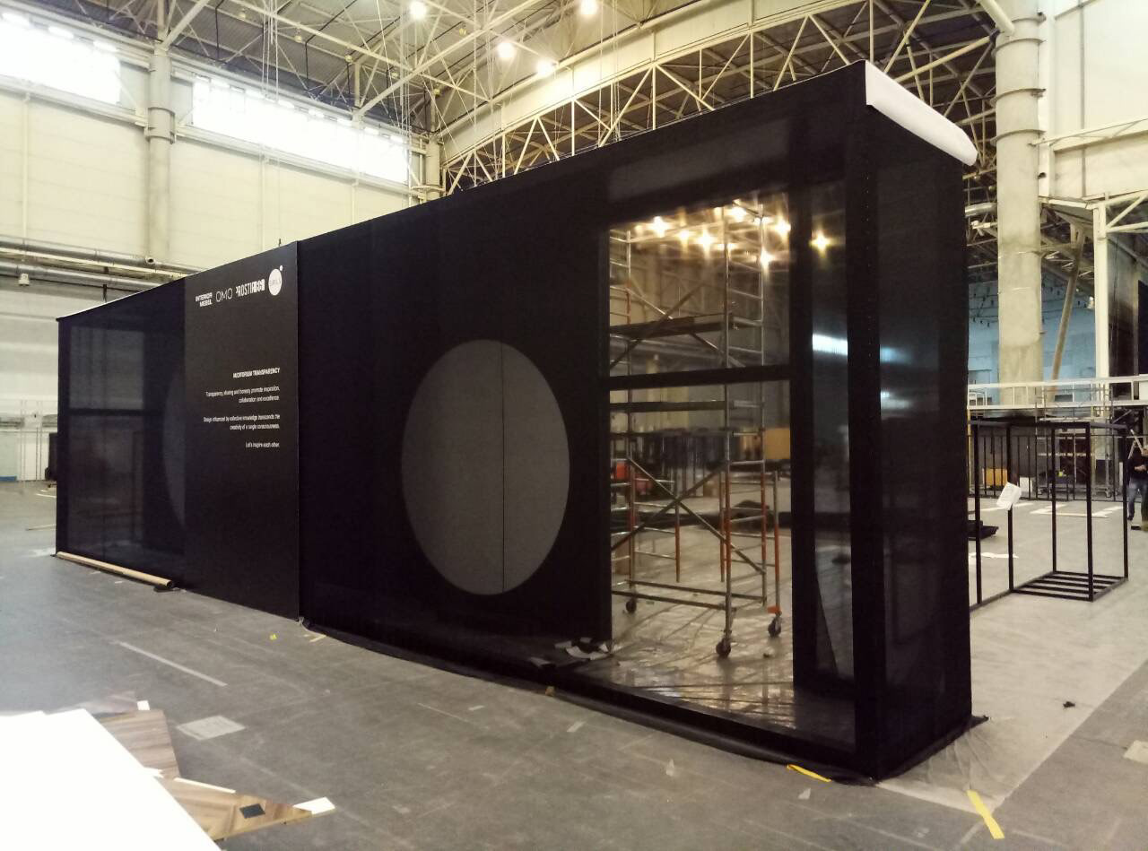
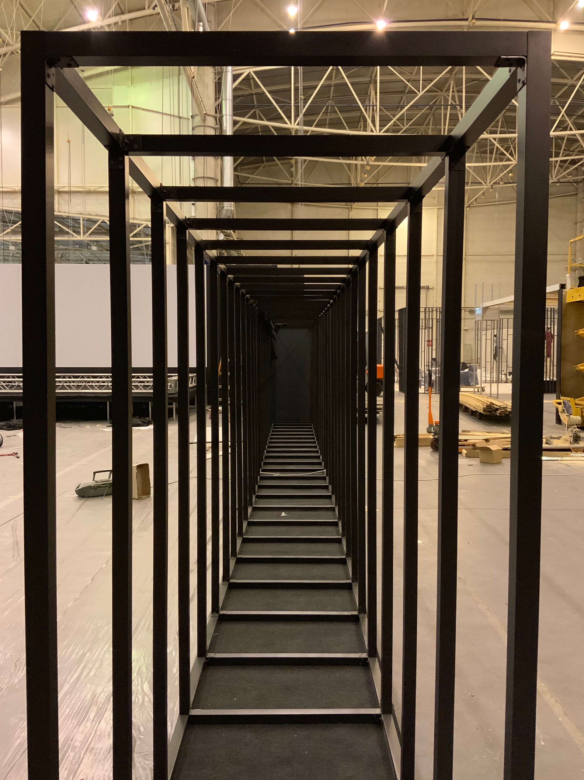
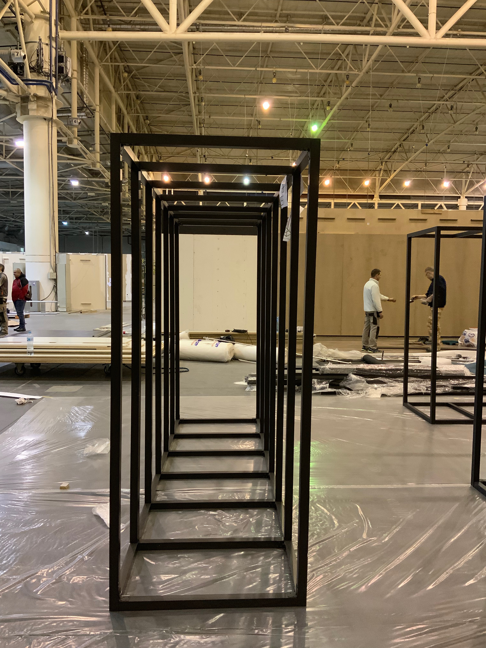
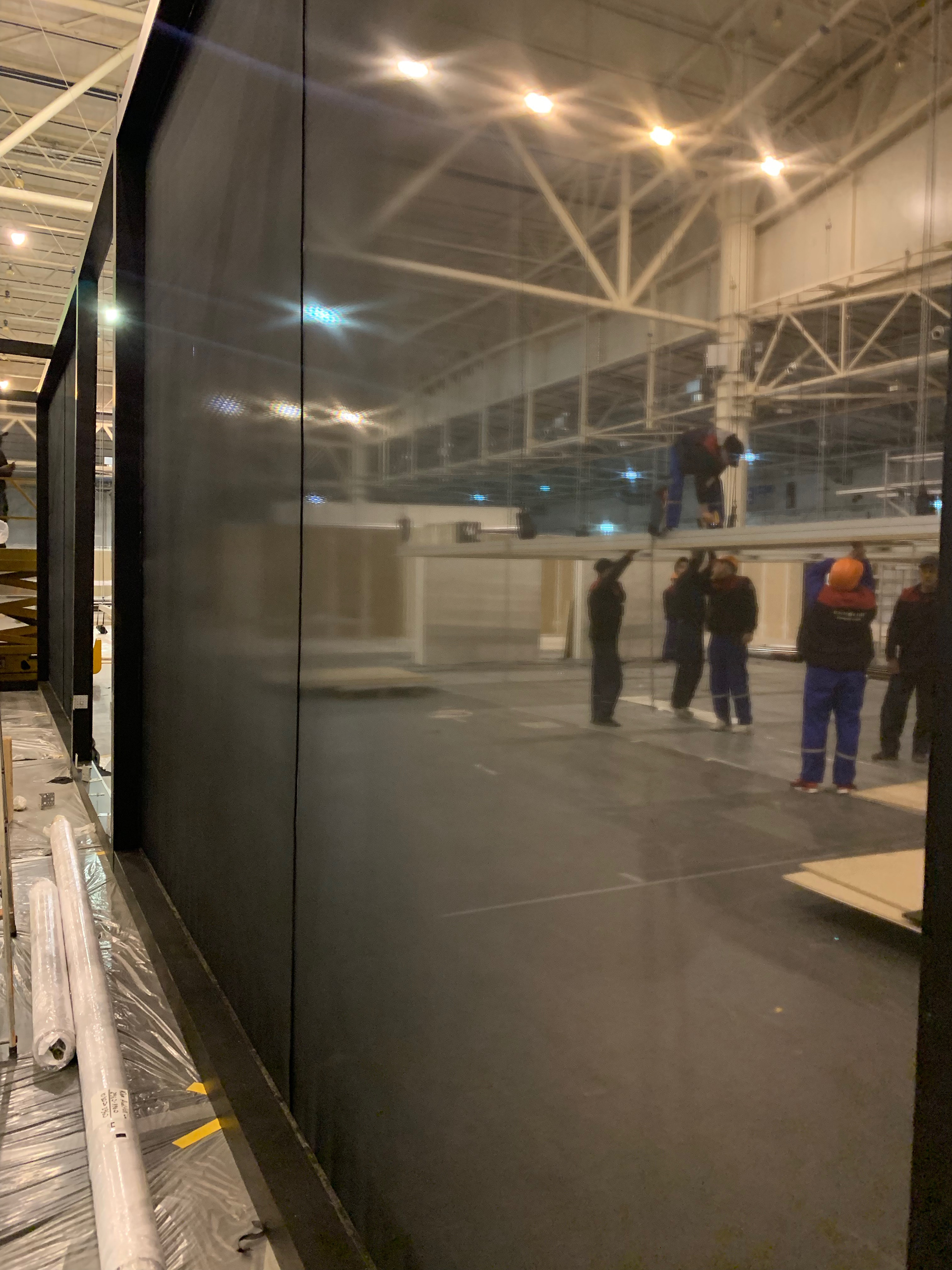
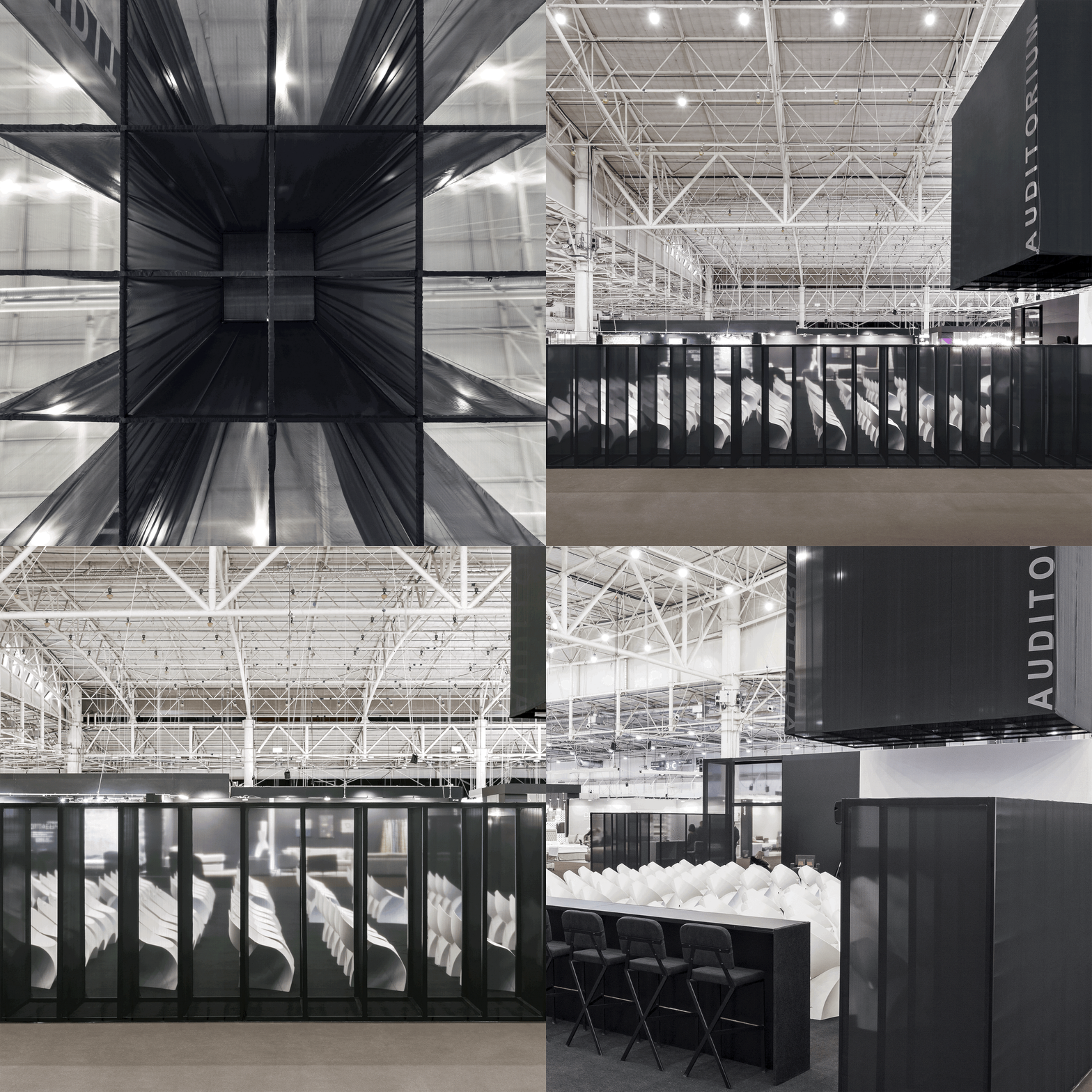
To highlight this topic visually, we designed rectilinear structures made of semi-transparent upholstered frames. This allows visitors direct views while interacting with the Auditorium whilst fading the view to those just passing by and creating shelter & comfort for those seating inside.
Auditorium Transparency: designed using our collective knowledge, transcending the creativity of a single consciousness.
Auditorium Transparency: designed using our collective knowledge, transcending the creativity of a single consciousness.
Finishes were made of semi-transparent material with a structure designed to deliver different experiences according to visitors needs:
• When passing by, the repetitive structure projects into a black surface, acting as a contrast backdrop to the exposition around
• When viewed from a distance or angle the faded blurred view prompts interests/intrigues
• When interacting with Auditorium the structure becomes see through
THE BRIEF was to design an Auditorium at the Interior Mebel Fair. The designed project had to be built within 3 days. It’s space had to accommodate 120 seats and to include reception, coffee shop, lounge and the TV programme area.
The functional space was divided into the main auditorium and the surrounding multi-use bar&lounge areas with the secluded lounge armchairs, standing/sitting desks and benches.
The functional space was divided into the main auditorium and the surrounding multi-use bar&lounge areas with the secluded lounge armchairs, standing/sitting desks and benches.
The CHALLENGE was to maintain an open structure while providing enough backdrop and comfort for the presenters.
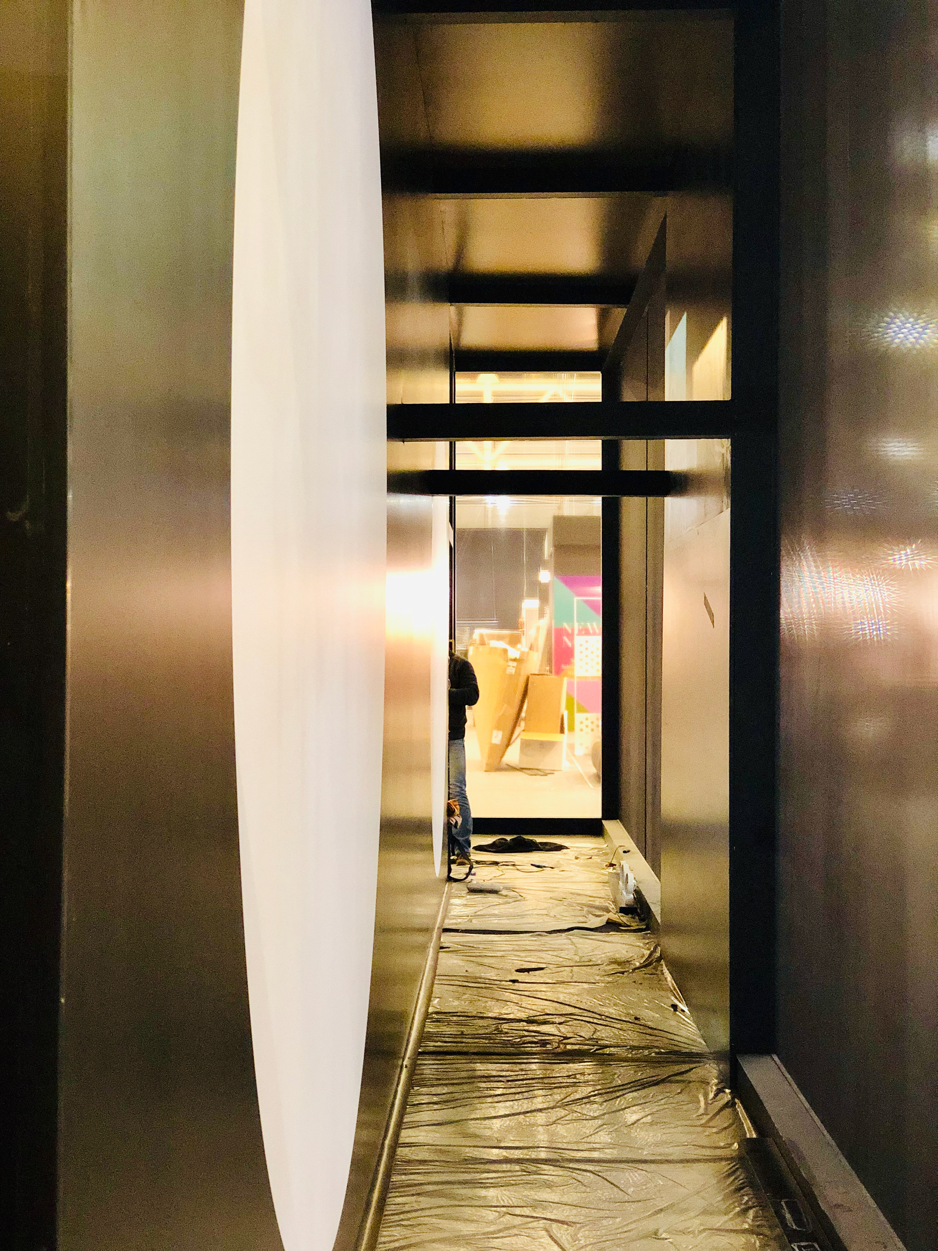
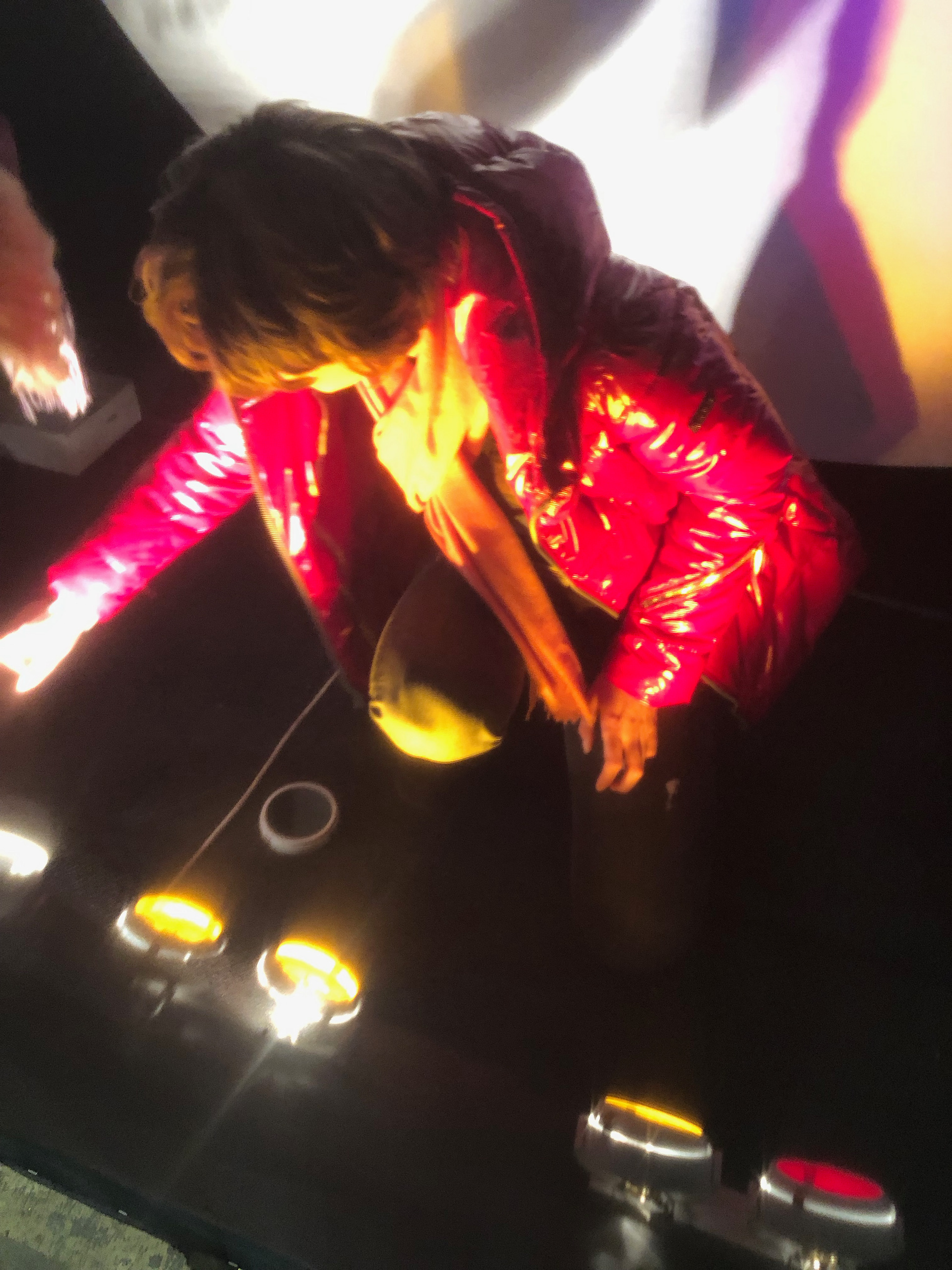
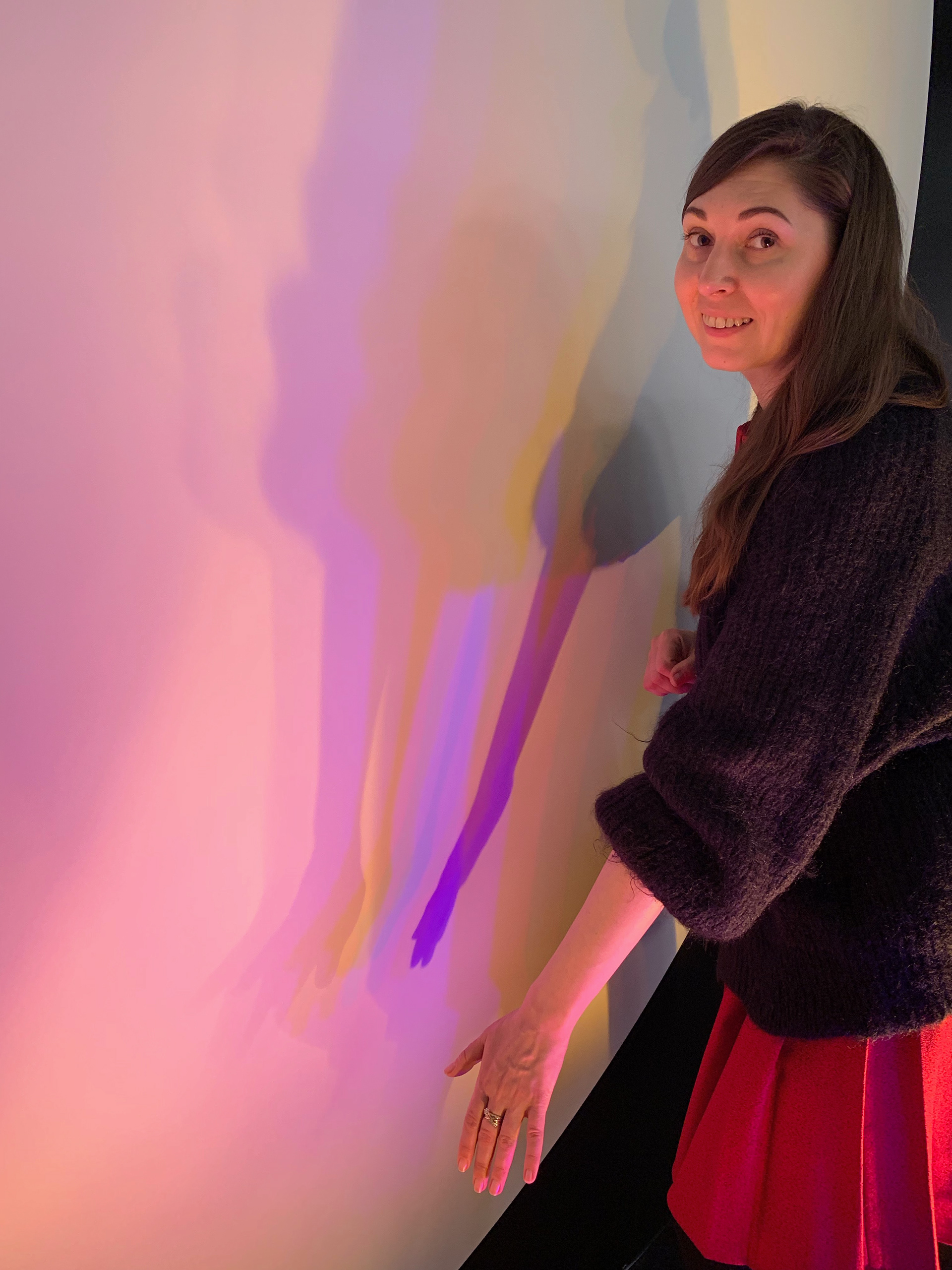
This inspired us to created a backstage tunnel which led people from the public walkway directly into Auditorium. The attraction was a Colourful shadow performance, created by visitors themselves.
Shadows changed in size and colour, allowing each person to create his or her own composition depending on their position. The interaction also entertained audience during the 15 minutes breaks between the lectures.
The project colours were kept monochrome except for the Shadow performance giving a neutral backdrop for presenters content, and to contrast with the over saturated colour-mix surrounding.
THE PEOPLE
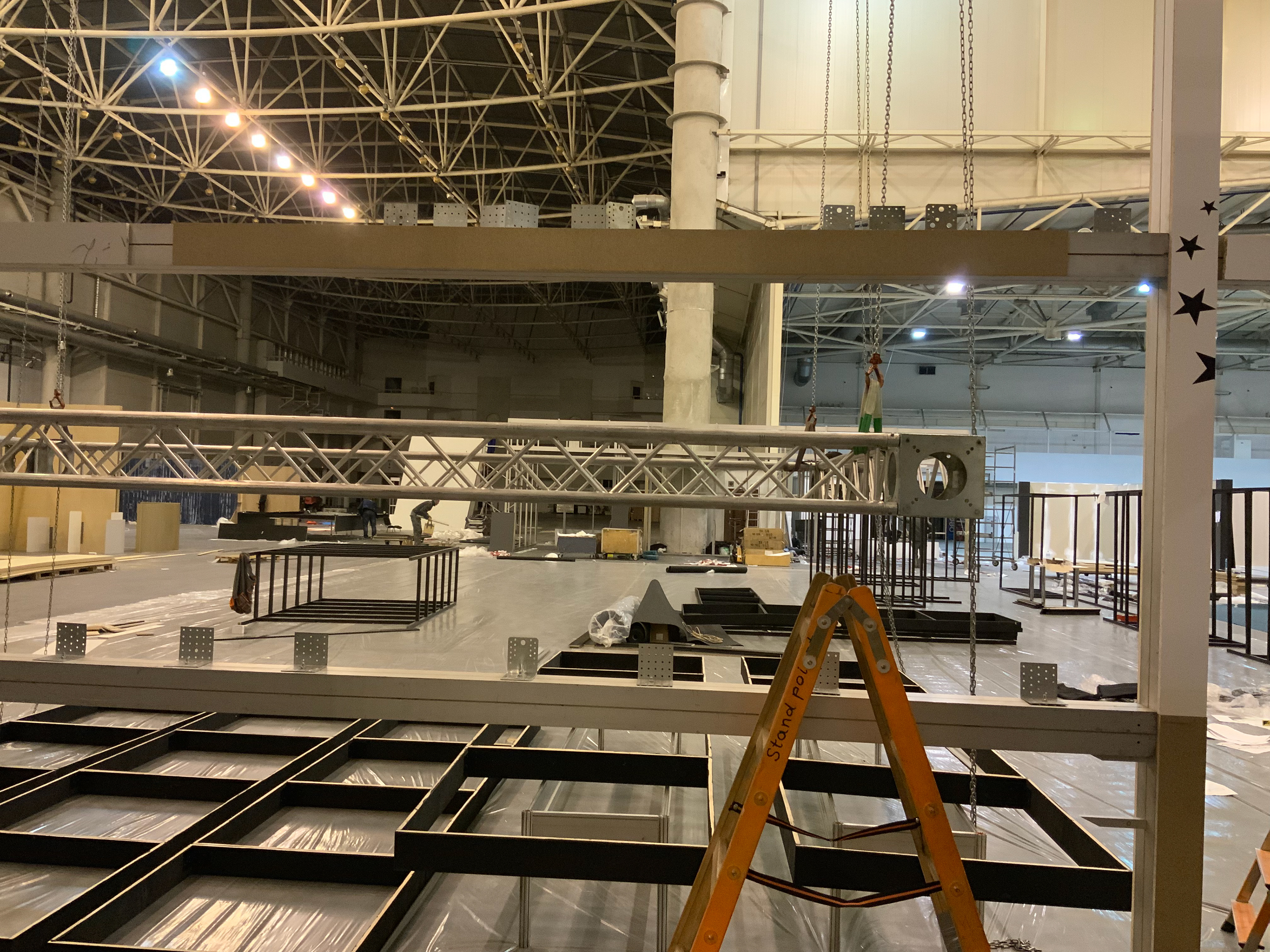
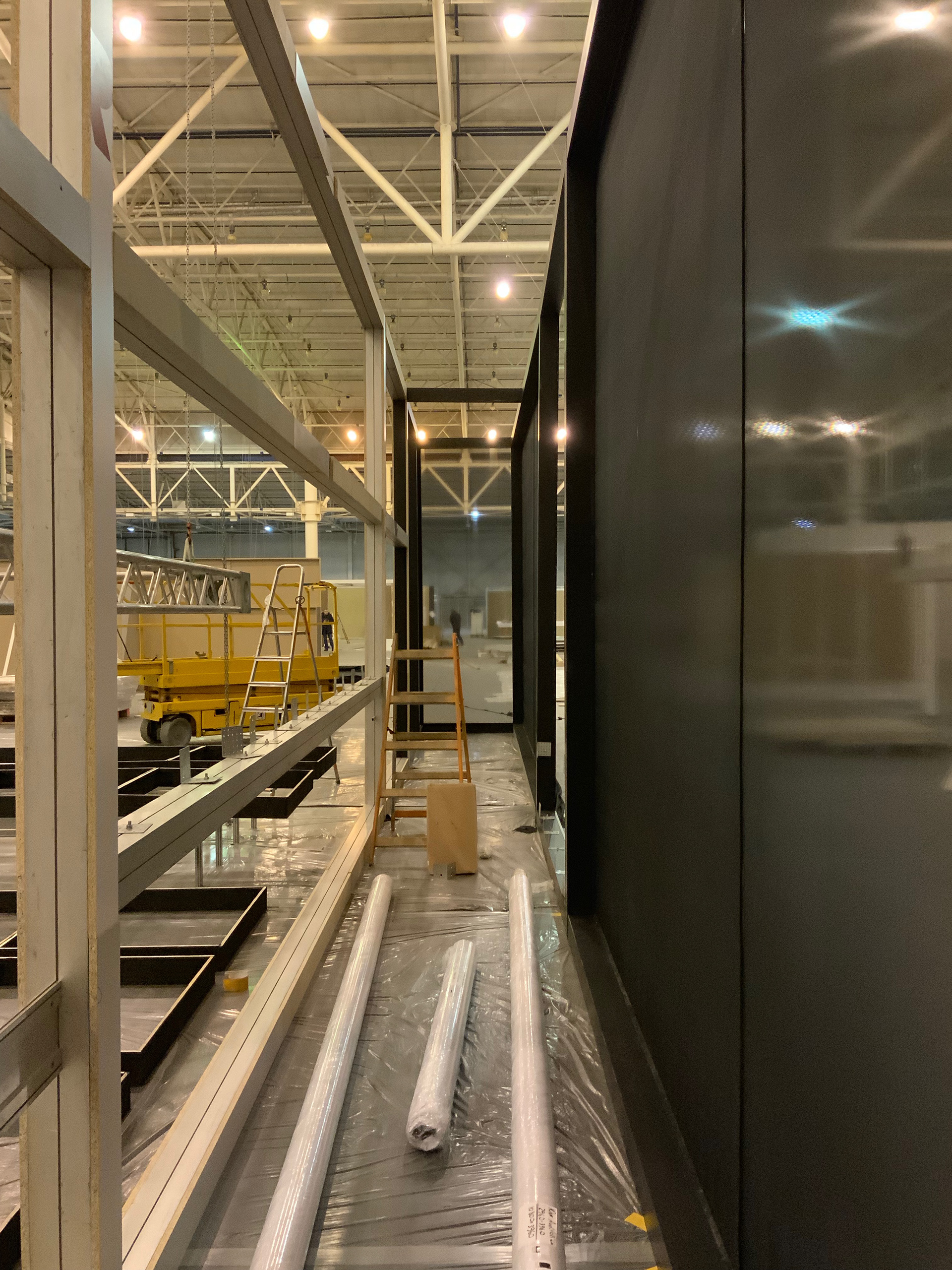
THE PROCESS
